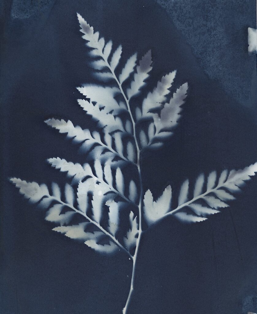
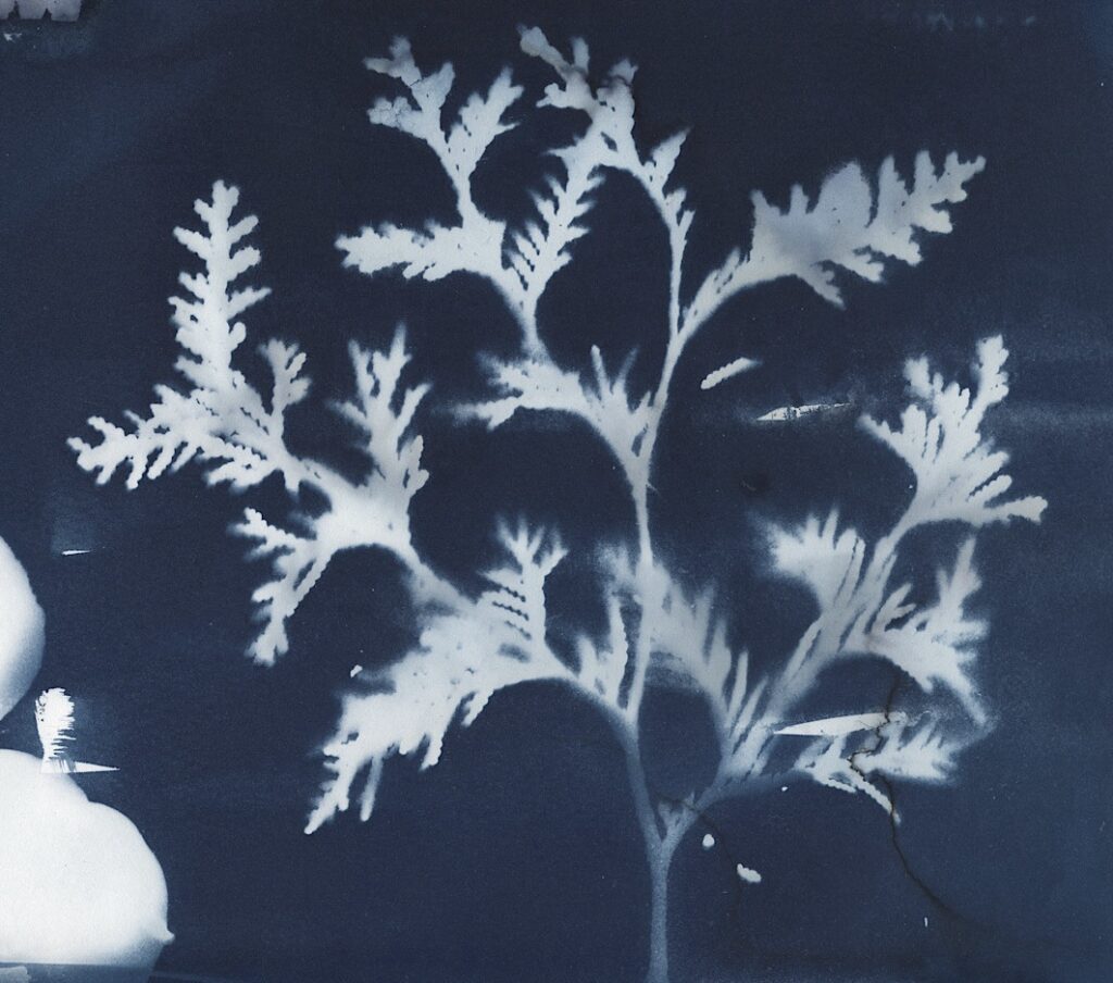
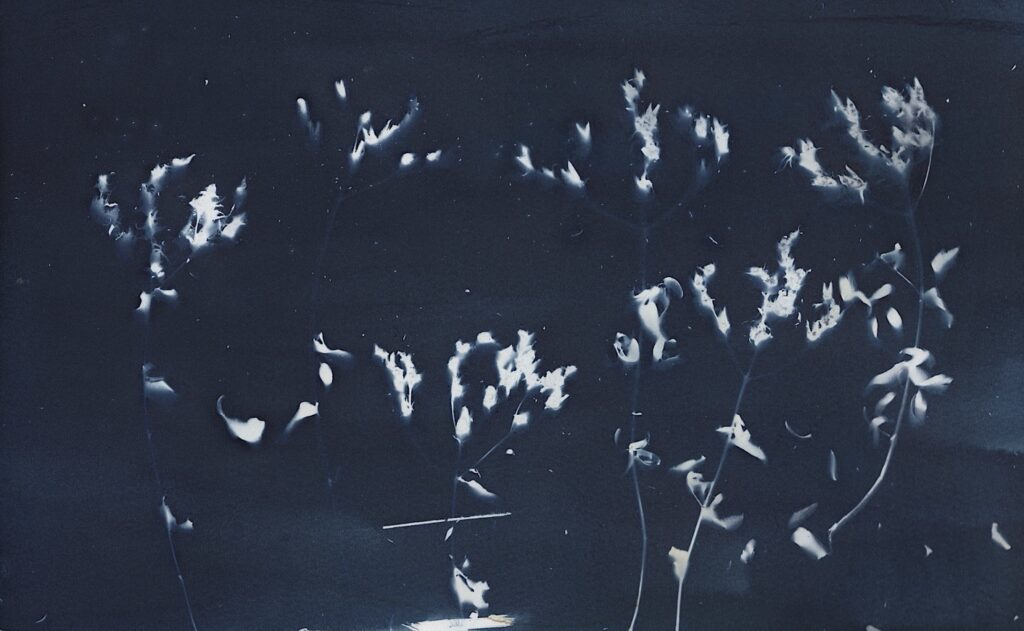
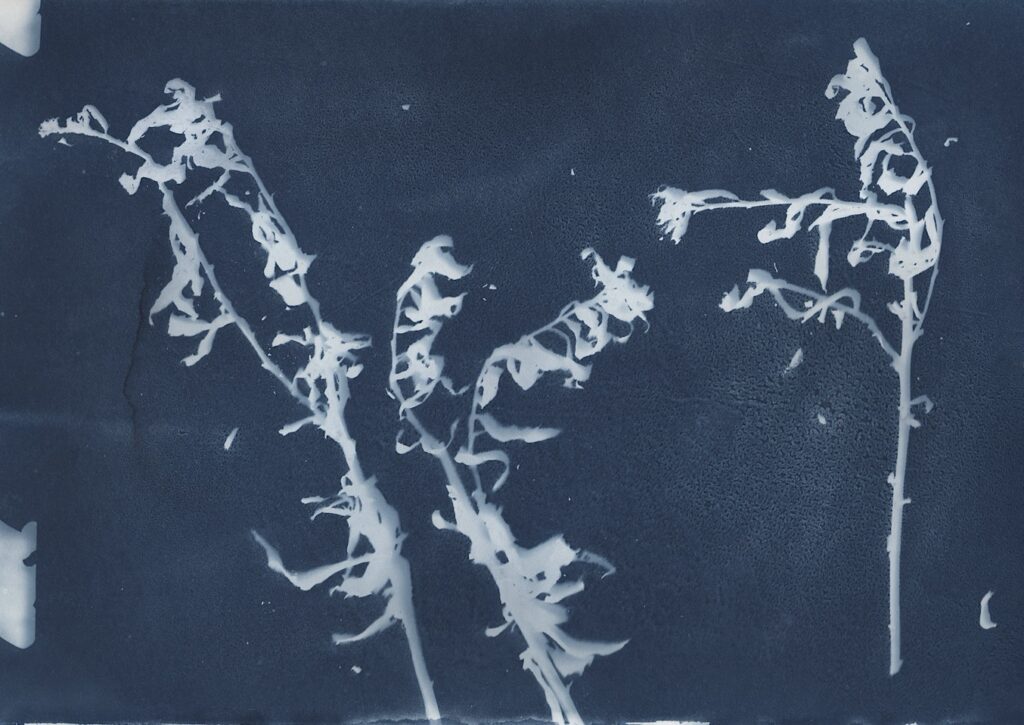
Winter cyanotypes
The cyanotype experiment worked out pretty well. I could have gotten more of the fragile stems to show up by pressing the glass or acrylic top more firmly onto the plant material. But they turned out crisp enough for me to use in GIMP.
It has taken awhile for me to recall the processes I use when making digital images. I seem to gravitate toward the same look over and over again. A silhouette of some real life thing. Here having the colors simplified, sort of, helps make this easier than using a photograph.
Steps for future reference:
- Make sure the version of GIMP is up to date.
- Upload image to the computer, and use GIMP to open it.
- Use Colors > Curves to heighten the contrast in the image
- Use Colors > Posterize to reduce the number of colors to 3. The colors often look very gaudy at this point.
- Use Select tools to isolate the plant image. This takes some playing around.
- Copy the selection and paste into a new layer.
- Copy the new layer and paste into the cover master file, somewhere above the background layer.
With the new layer selected, I can edit the image. Usually I do some combination of these things:
- Use Paintbrush tool to paint the image white (either before or after pasting).
- Use Transform > Scale to change the size of the new layer (either before or after copying).
- Use Move tool to move the image to the best spot, and/or use Rotate tool to rotate it.
That’s the general idea! By the time I’ve worked with the images for a few weeks, I’ve gotten the hang of it. Only to put it away for a few years and have to learn it all over again!
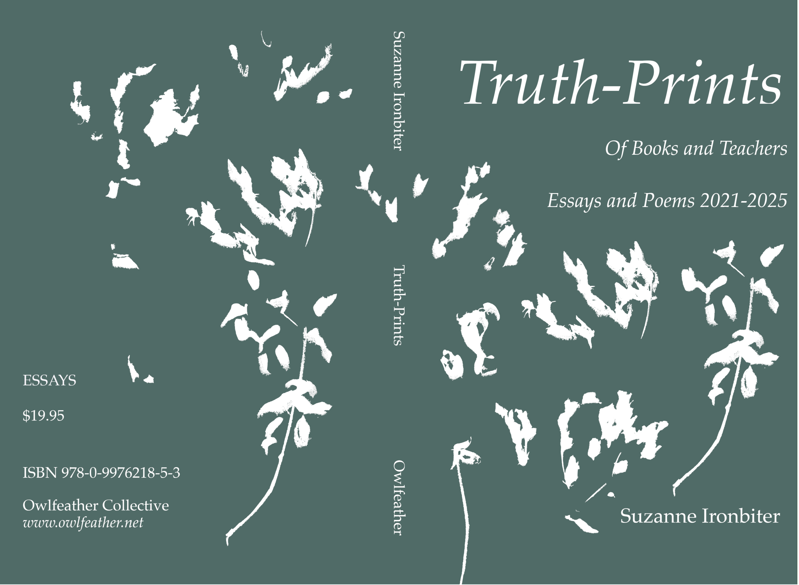
Here’s the sample cover so far: