Watercolor Monotypes
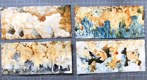
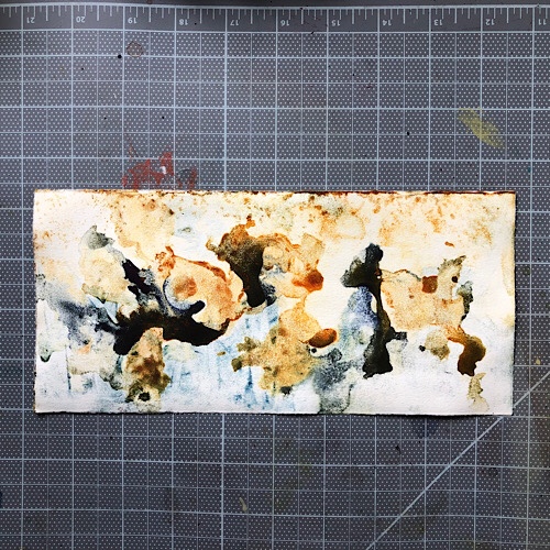
Very keen on watercolor monotypes. I realized I needed to standardize them somewhat i.e., make a series if it was going to work as a book interior. I finally hit on a palette that was interesting enough to me to explore. Mostly because of the way the Daniel Smith quinacridone gold pushed the other gold out of the way, leaving interesting blotches. I combined with one of a number of blues.
Lots of learning experiences:
- Making a series was a big breakthrough.
- Behavior of paints can make it interesting.
- I don’t have to cover the whole page edge-to-edge. I can make a figure in the middle.
- I don’t have to clean the plate after every monotype. In fact, I really enjoy the “dirty” look.